Appearance
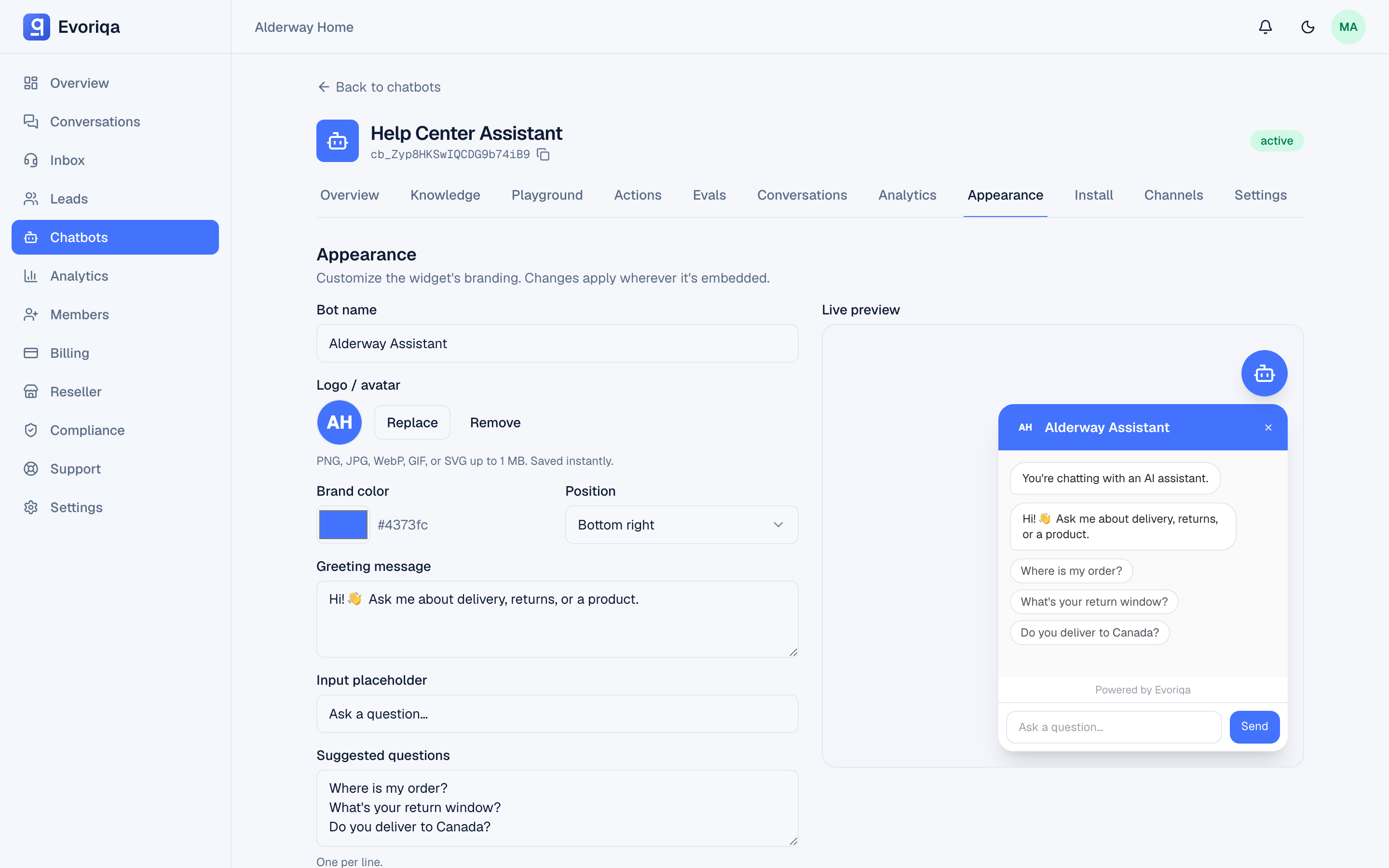
Every widget appearance option — colours, avatar, position, suggested questions, proactive nudge, AI disclosure, and the Powered by badge.
Open a chatbot and choose Appearance. Changes save together with the bot name and greeting, and reach the live widget within about a minute (the widget's config is cached briefly; saving clears the cache).
Colours and typography
| Setting | Effect |
|---|---|
| Primary colour | The main brand colour — launcher, header, and visitor bubbles. |
| Secondary colour | An accent used alongside the primary. |
| Background colour | The panel background. |
| Text colour | The panel's text. |
| Bubble colour | The launcher bubble, when it should differ from the primary. |
| Font family | A font name for the widget, up to 120 characters. |
| Custom CSS | Free-form CSS for fine adjustments, up to 20,000 characters. |
All colours are hex values.
The widget lives in a Shadow DOM, so your site's stylesheet cannot reach into it — that is why fonts and tweaks go through these settings and the custom CSS field rather than your own CSS file.
Identity
- Avatar or logo — upload an image on the Appearance tab; it appears in the widget header and on the launcher. Uploads are size-capped and content-checked. Removing it restores the default.
- Bot name and greeting message — see Chatbot settings. A greeting left at its default follows the visitor's language; wording of your own does not.
- Placeholder text — the input's prompt, up to 120 characters. Its default follows the visitor's language too.
Language
The widget's own text — header, buttons, composer, status line, forms, and dialogs — is shown in the chatbot's pinned language when its Language setting names one, otherwise in the visitor's browser language, otherwise in English. 32 languages are covered, and Arabic, Hebrew, Persian, and Urdu render right-to-left.
The opening copy follows the same resolution, with one condition: a field still at its shipped default is shown in that language, while a field you filled in yourself is shown exactly as written, to every visitor. That covers the greeting, the placeholder text, the proactive message, and the AI-disclosure line. So leave a field at its default to have it follow the visitor, or type your own text to pin it.
The live preview on the Appearance tab follows the pinned language too — the default greeting, placeholder, and disclosure, the Send button, and the "Powered by" line, right-to-left where the language is — and names that language above the preview. A chatbot left on English previews in English, because each visitor then sees their own language. Each of these fields carries a short hint saying the same.
Full behaviour is on Languages.
Layout
- Position —
bottom-right(the default) orbottom-left. A single embed can override this withdata-position— see Install the widget.
What the visitor is offered
| Setting | Effect |
|---|---|
| Suggested questions | Up to 10 starter chips, each ≤ 200 chars, shown before the visitor types. |
| Show sources | Whether retrieved sources are listed beneath an answer. |
| Collect leads | Turns lead capture on, with a timing mode. See Lead capture settings. |
Suggested questions are worth setting deliberately: they teach visitors what the agent is good at, and they are the cheapest way to steer traffic towards questions your knowledge base answers well.
Proactive nudge
The widget can open a small prompt on its own after a delay.
| Setting | Value |
|---|---|
| Proactive enabled | On or off |
| Proactive message | Up to 300 characters |
| Proactive delay | 0–600 seconds |
Keep the delay long enough that the visitor has read something first.
AI disclosure
Turn on AI disclosure to state plainly that the visitor is talking to an AI assistant, with your own wording (up to 300 characters). Enabling or changing it is recorded in the audit log — some jurisdictions require the disclosure, and the record is the evidence that it was in place. See AI disclosure.
The Powered by badge
"Powered by Evoriqa" shows in the widget by default. Removing it requires a plan that includes branding removal — see Plans. Reseller organisations carry their own brand here instead; see Branding and domain.
Where to go next
Last updated